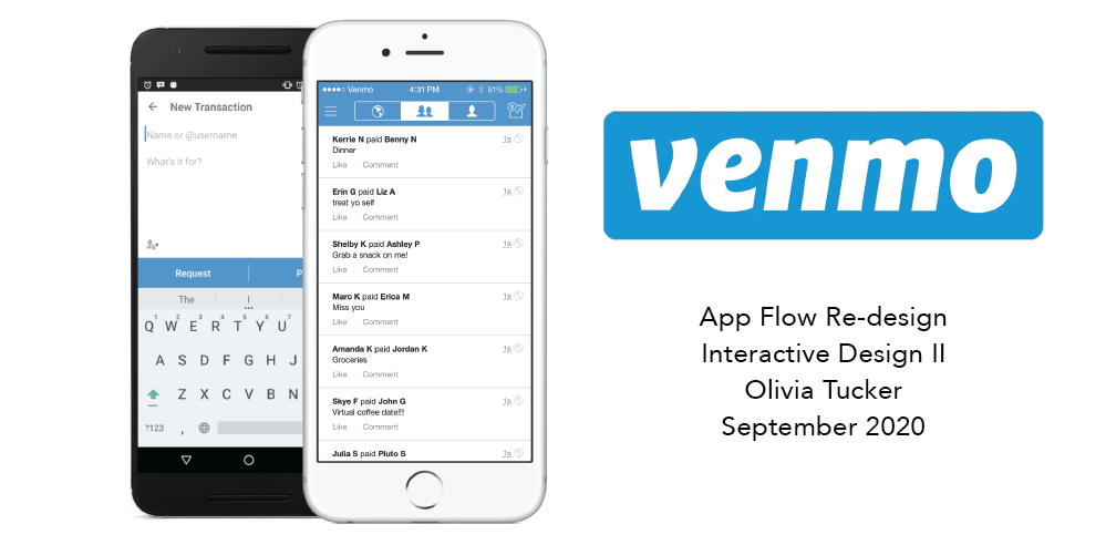
Venmo Re-Design Case Study
Featured below includes one of my Interactive Design Case Studies. This project showcased my user research, user experience and interface knowledge, coding, and graphic design skills.
See what I did
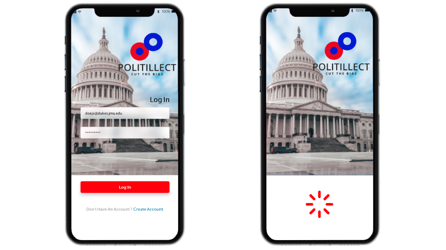
Politelect App Creation
This project included a full design of a new app titled "Politillect." This project showcased app flow design, user research, user experience and interface knowledge, coding, wireframing, prototyping, and graphic design skills.
View the ReportThe Introduction
As electronic currency and digital wallets become increasingly prevalent, digital technology has already revolutionized the way we think about money. While just years ago almost all monetary exchanges were physical and tangible, digital money has become more of a conceptual transaction that exists purely in a digital form. When it comes to digitally exchanging money, user experience and interface design is as important as ever.
Venmo is a service owned by PayPal allowing its users to exchange and transfer money between friends. Venmo has gained vast popularity since its invention in 2009 and offers millennials a more social way of sharing their transactions between various accounts. As a college student who has to constantly transfer money between friends, I find myself using Venmo multiple times each week. Although I think Venmo has done a great job thus far pioneering a social and digital money transfer application, there are many flaws that exist from a user perspective. Throughout this case study, I plan to examine two main user pain points.
User Research
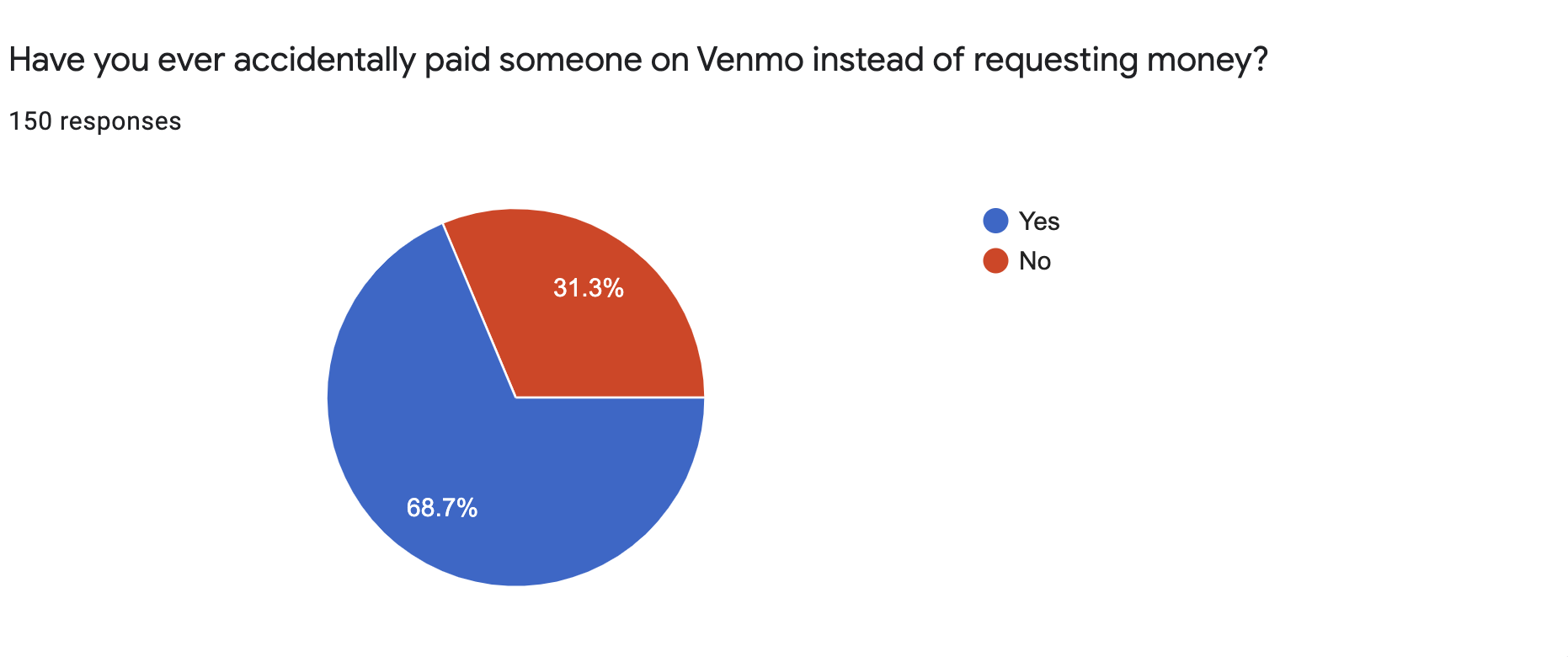
In order to gain a better understanding about Venmo’s faults, I held a Google Survey on my social media. These participants are Venmo users with ages that range from 18-47, totaling 45 male responses and 105 female responses. I capped this poll at 150 participants, thrilled to be able to collect such a large sum of data through social media. These participants answered multiple choice yes or no questions, were able to “check those that apply,” and wrote in some short answer responses. The trends in this data provided me with essential information as to how I can improve the overall Venmo user experience.
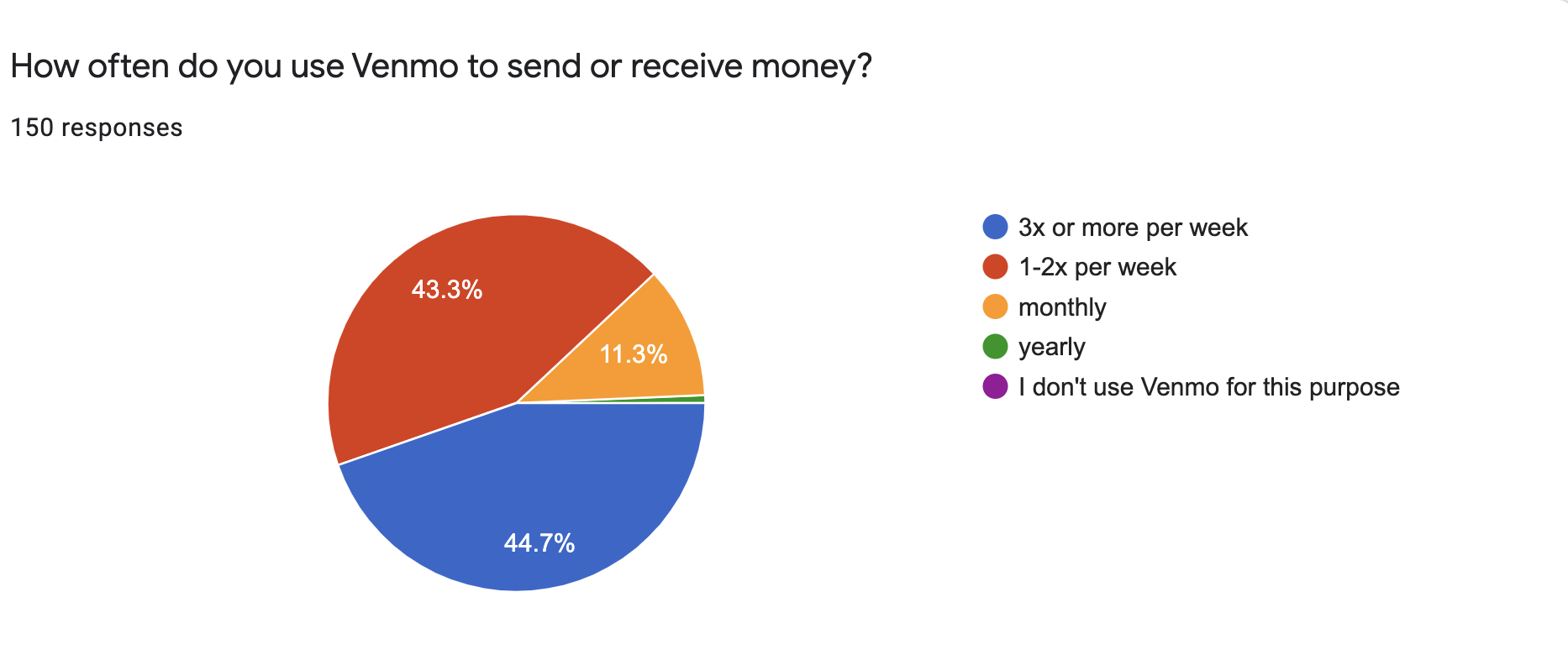
As you can see from these responses, nearly half (47%) of those surveyed find themselves using the Venmo app at least 3 times a week. This rate of use shows that Venmo is one of the most competitive digital money applications.
Out of 150 Venmo users who were asked if they have ever been frustrated with Venmo, 54% said yes. As a company that is handling people’s money and trust, it should be taken seriously when over half of the users agree they were unsatisfied with at least one of their experiences.
Through other questions asked throughout the survey, it is clear the source of frustration stems from Venmo’s interface design. By redesigning problematic pages, I think this application experience can be improved.
Design Questions
As an application, how can we improve the experience of Venmo users by redesigning the pay option and decreasing the margin of error?
How can we make Venmo tasks more convenient for its users? (For example, paying people who you are not friends with on Venmo)
Pain Point 1: Paying vs. Requesting Money
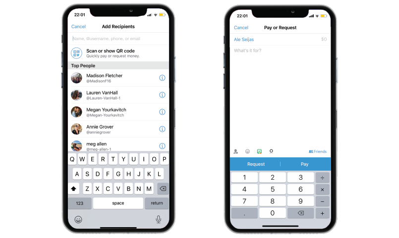
Based on the design placement of the “pay” and “request” options, it is far too easy to confuse the two. The only separation between the two is one small white vertical line.
Out of 150 people surveyed, 68.7% or 103 people have accidentally paid someone on Venmo instead of requesting money. For a platform as widely used as Venmo, this margin of error is unacceptable. The main purpose of Venmo is to transfer money between various friends or accounts, and the option to pay or request should be abundantly clear to its users.
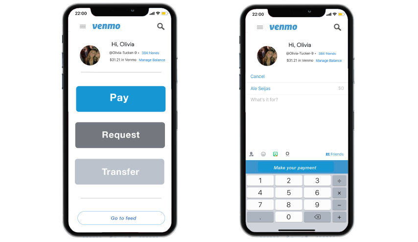
Venmo's Current Design
Visibility: To improve visibility, Venmo must:
Lead users on a clear path to payment
Lead users on a clear path to requesting money
Simple redesign to prevent errors
The Re-design
My vision for a newly curated home page and pay or request interface.
How does this new design improve visibility and function?
Visible separation between the pay and transfer buttons
Focuses on the 3 most popular actions the application is used for
Less busy, more simplistic
Offers a view of account balance and profile on home page
Different colors help emphasize different app functions
Pain Point 2: Paying Friends, and Strangers
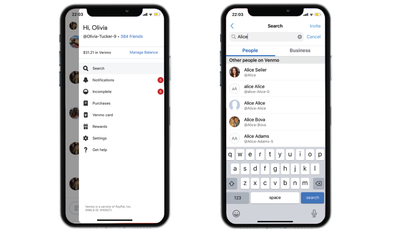
As a company that is handling people’s money and trust, it should be taken seriously when over half of the users agree they were unsatisfied with at least one of their experiences. The second pain point dives further into the pay options. If you go to pay someone on Venmo whom you are not previously friends with, you cannot look at their profile photo alongside their profile to confirm it is them. This is a design flaw because it requires users to take an extra few steps and search who they are looking for, make sure it is them, then go back to the main page and pay the user, hoping they remembered the correct account. If this information was consolidated, this would make paying new accounts more dependable. In addition, there should be an option to pay multiple people at once in a group setting. For many, Venmo is used as a common ground application where groups of friends, roommates, families, or co-workers exchange their money. Unlike iMessages, Venmo does not have an option where you can request money from multiple people at once. Although it has a “split fare” option, users do not always want to evenly split specific costs.
Venmo's Current Design
Standardization: To exhibit standardization, this redesign should:
Present obvious access to the search bar
Allow all venmo usernames to show up on payment page
Show profile photo alongside username
Allow users to make groups to pay all together
The Re-Design
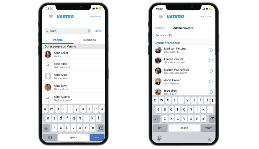
How does this new design improve standardization?
Option to pay users directly after search
Shows username alongside profile photo (If applicable)
Group Pay Option
Shows users who the group members are
Allows users to name the group for convenience
Conclusion
The opportunity to re-design such a notable platform like Venmo gave me a much deeper understanding for user research and the user experience. Oftentimes, it is easy to overlook user problems when an app has gained a lot of praise or notoriety. However, this project reminded me how important it is to be an articulate designer who always keeps the user in mind. There is always room for improvement. App Flow should be effortless, and I will take that information with me as I continue to create with passion and purpose.
Politelect Project Report